Friday 16 April 2010

7:Looking Back At Your Preliminary Task (The School Magazine Task), What Do You Feel You Have Learnt In The Progression From It To Full Product


Since creating my school magazine my knowledge of using Photoshop has increased considerably. For example I now know how to make elements of my magazine stand out more by using drop shadows and outer glows. In addition to this, I learnt how to select parts of photos using the quick selection tool in order to cut things out. An example of this would be the guitar fret on my front cover which gives the magazine a more dynamic, 3-D appearance than my school magazine. I've also learnt how to download newer more interesting fonts, increasing the visual appeal of my magazine. As well as this, the complexity of my page layout has increased as I've learned how to use layers in Photoshop more effectively.

Overall my understanding of the software has improved greatly throughout this project because at the start I'd barely used Photoshop and now I have produced a professional looking magazine using it.

6:What Have You Learnt About Technologies From The Process of Constructing This Product

This is the Dell inspiron laptop I used to create my magazine on. I did use the school Apple Macs during lesson times but the majority of my work was done on this laptop.


I also used this memory stick to transfer the work I’d done on the apple macs to my laptop.


I used this Lumix Panasonic DMC-FS62 digital camera to take all of my photos.


I learnt how to use “Adobe Photoshop CS3” by creating my magazine and editing my photos on it.


However, I did also briefly use Adobe Indesign CS4 for the preliminary task.


In addition to this I created a blog account using “Blogger” to post all of my research and planning activities as well as my final magazine and evaluation.


I uploaded my photos onto “Photobucket” after creating an account, and then embedded the link onto my blog.


Similar to this, I also used “Flickr” to upload the final version of my magazine so that I could write notes on how it would attract the audience.


To edit my videos I used “VideoPad Video Editor” and also “Sound Recorder” on my laptop to record my narration.


I then uploaded my video to “Youtube”.


As well as this I used “Microsoft Office PowerPoint” to create my presentations and then uploaded them onto “Slideshare”, before embedding the links on my blog.


Overall I have learnt a lot about technology throughout this project; before creating my magazine I'd never used Slideshare, Photobucket, Flickr, Blogger or InDesign. In addition to this, I'd never edited a video or uploaded one to youtube before. However I now feel confident in using all of them.

5:How Did You Attract/Address Your Audience

Front Cover

(Click on photo to see tags)

Contents

(Click on photo to see tags)

Double Page Spread

(Click on photo to see tags)

In addition to this, I addressed my target audience by constantly asking what their opinions were regarding my magazine throughout it's production. See below for the audience feedback of my final magazine:-


As well as this, most rock magazines are predominantly aimed at men - they feature mainly all male bands and are written in a way that appeals to men. Therefore the unique selling point of my magazine is that although it's not exclusively aimed at women, it does have a slightly softer writing style than say "Kerrang!" or "Rock Sound".

4:Who Would Be The Audience For Your Media Product


The target audience for my magazine is aged 14-19 male and female, but with a slight bias to female in the familiar way my magazine is written.

Typically she will be found constantly plugged into her ipod whether she's doing her artwork or out and about with mates. Her ipod features newer less established and uncommercial bands as well as bands like Paramore, Green Day and You Me At Six. Her free time is spent at concerts and festivals or discovering new bands on the internet, therefore she doesn't spend that much time watching television. Because most of her money is spent on new albums and concerts, she doesn't spend that much money on clothes, preferring to shop at Primark, TK Maxx and Matalan, although most of her wardrobe consists of band t-shirts from past concerts and a pair of old worn out jeans.

3: What Kind of Media Institution Might Distribute Your Media Product and Why?

I think that a media institution such as IPC Media would be the best to distribute my magazine. This is because, although it already distributes music magazines such as "NME", "Uncut" and "Guitar and Bass" my magazine is aimed at a much younger audience than these, therefore there is a gap in the market for it. In addition to this, the fact that it already distributes such well known music magazines means that they have the necessary experience and loyal consumers who might be interested in a new branch of music magazine - "LIVEwire".
I did initially consider Bauer Media to distribute my magazine because it has over 80 influential media brands and reaches over 19 million people. However, it already distributes music magazines with a very similar target audience and genre, for example "Kerrang!". Therefore it would be unlikely to distribute a competitor to one of its existing successful magazines.

2: How Does Your Media Product Represent Particular Social Groups


I have chosen to compare this picture of Rinoa from “Rock Sound” with the front cover photo from my magazine to explain how my magazine represents a particular social group.


The postures of both men are similar in the sense that they’ve both got their hands in their pockets. They also share similar facial expressions – both serious and staring straight at the camera, although Andrew’s eyes are hidden by his aviator sunglasses. In addition to this, both men are wearing similar costumes – jeans and a t-shirt layered with a shirt on top. As well as this, the background setting is very similar – both pictures were taken outside on a field with trees in the distance. However, the lighting used in the photos is different with one displaying a much brighter blue sky and the other a more overcast grey outlook. Also, they have different hairstyles – Andrew’s is longer, darker and covering his face more, whereas the man from Rinoa has shorter, lighter gelled up hair. Overall I think that these elements of the photos represent a normal young social group and that my magazine reflects this throughout – the people featured in my magazine are quite normal looking – there’s nothing extreme or obscure about their appearances.

Thursday 15 April 2010

1: In What Ways Does Your Media Product Use, Develop or Challenge Forms and Conventions of Real Media Products


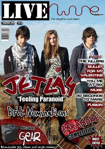
1 – The Title of the Magazine

For the masthead of my magazine I used “Stencil Std” as my font for the “LIVE” section and a photo of a guitar amp wire spelling “wire” which I’d manipulated using Photoshop for the other section. I stuck to the colours black, white and red because these colours seem to be the classic colours associated with rock – the genre of my magazine. The “LIVE” section of my masthead follows the codes and conventions of some existing magazines. For example it could be compared to “Kerrang!”, in the sense that this masthead is also bold, white and surrounded by a black box:-


The masthead for “Q” is also surrounded by a box and uses the colours red and white:-


However, the masthead for my magazine does also challenge the codes and conventions of real magazines as the “wire” section is very thin and wavy. This challenges the conventions of magazines because mastheads are normally thick and bold. In spite of this, I think my masthead works because it combines the conventional and unconventional features of a masthead, making it unique and therefore more eye-catching and memorable.

2- Mis-en-scene of images
I think the mis-en-scene of my images follow the codes and conventions of magazines. This is because, I used a variety of settings for my photos ranging from a graffitied underpass to a deserted wasteland, similar to those used in magazines like “Kerrang!” and “Rock Sound”. These landscapes fit in well with the concept of my magazine because they reflect the essence of rock that I was trying to capture. In addition to this, the majority of my images follow the conventions of magazines by displaying the band as moody, serious and not caring what others think. This is portrayed by their mode of address – they’re looking directly at the camera in most of the photos.

3- Costumes and Props
The costumes and props used throughout “LIVEwire” are conventional. This is because the band in my magazine wore costumes which included black eyeliner, ripped jeans, leather jackets and aviator sunglasses. All of these items could be found in real music magazines. In addition to this, the props features are commonly used in existing magazines as they are staples of the rock star image - for example the black electric guitar.

4 – People

The people featured in my magazine are quite unconventional. This is because they’re quite young and not as extreme or obscure in their appearance as some bands featured in rock magazines. In addition to this, most bands in real magazines seem to include at least four or five male members. Therefore I’ve been unconventional by featuring a band which consists of one female and two males. However, because my target audience is teenagers with a slight bias towards females in the way my magazine is written, I think that the unconventional choice of people in relation to existing magazines, won’t be an issue. This is because by using teenagers on the front of my magazine and featuring a girl as the main singer, the audience will be able to relate and aspire to be like them; the target audience are more likely to be interested in a teenage band than a middle-aged radical band.

5- Title Font and Style
I created the title “Jetlag” by using a brush tool in photoshop and then adding an outer glow and drop shadow to it. I think my title is slightly unconventional in the sense that the letters are positioned at varying angles, whereas real magazines tend to keep their headlines in a straight line. However I feel that this will appeal more to my teenage audience because of its visual impact. On the other hand the title is conventional in the sense that it has the largest font size on the page, apart from my masthead, and it’s bold and stands out. In addition to this, the way the title looks worn away and slightly rough is similar to real music magazines like the ones I analysed at the start of the project.

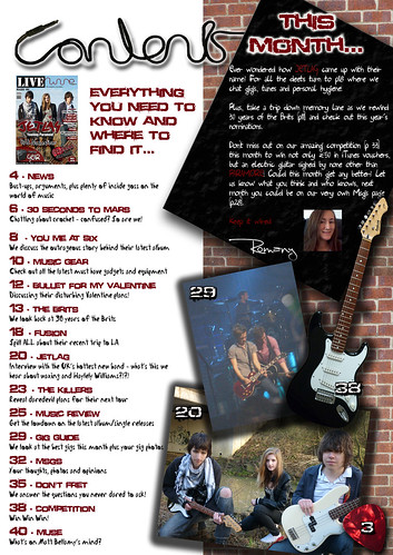
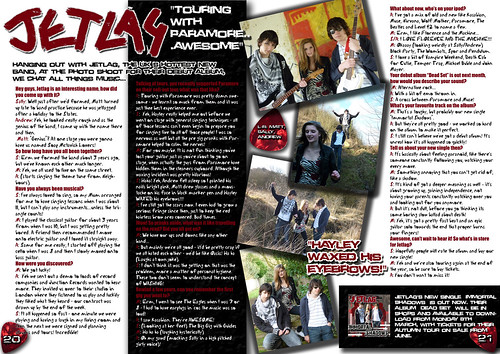
6- Written Content
The written content of my magazine follows the codes and conventions of a real music magazine by covering similar topics in the questions. For example, it asks about the bands first concert, what’s on their own ipod, how they came up with their name, what their new album is about, touring experiences etc. All of these topics could be found in a real music magazine aimed at teenagers and young adults. In addition to this, the standfirst follows conventions by introducing the band at the start of the interview. Furthermore, the editor’s letter featured on the contents page has a chatty, familiar mode of address which is conventional.

7- Music Genre And How Your Magazine Suggest It

The main genre of my music magazine is rock with indie influences. This is quite clear throughout my magazine because of the props on display. For example, I used a plectrum as the page number, a guitar fret on the front cover, an electric guitar on the contents page and a guitar amp wire for part of the masthead. In addition to this, the bands listed on the front cover and in the contents page are of the same genre. As well as this, the use of black, white and red throughout my magazine (classic rock colours) and the mis-en-scene of the images emphasises that “LIVEwire” is a rock magazine. Real music magazines suggest their genre by the mis-en-scene of their images and the bands included, therefore my magazines follows the codes and conventions.

8 – Layout
The layout of my magazine is mainly conventional. This is highlighted on the double page spread which displays an interview in columns beneath a standfirst and title. In addition to this, the photos are arranged at angles with quotes dotted on the page. As well as this, my front cover follows layout conventions by having the masthead at the top of the page, a list of bands down the right-hand side and a main headline across the middle. However the positioning of my barcode is unconventional because it’s displayed beneath the masthead rather than in the usual bottom right-hand corner.

9 – Contents Page
My contents page contains elements that follow the codes and conventions of existing music magazines. For example it features an editorial which includes a handwritten signature and a photo of the editor. However, in comparison to the contents pages I analysed at the start of this project, the layout of my contents is not as regimented and grid-like as “Kerrang!”, thus making it slightly unconventional. In spite of this, I think that the arrangement of the photos, use of a brick wall and quirky fonts would appeal to the teenage audience more than a uniformed layout.